Azure DevOps Diagrams: 3 Ways to Keep Architecture Docs Alive


Azure DevOps does almost everything. Code repos, pipelines, boards, test plans — it's a complete platform for managing software teams.
But there's one thing it doesn't do well: keeping architecture diagrams alive.
Your wiki has a diagram from six months ago. The system it describes has changed three times since then. Nobody wants to manually update a PNG every sprint. So the diagram stays frozen while the architecture moves on.
Sound familiar?
If you're using Azure DevOps and struggling to keep documentation current, you're not alone. Let's look at what options you actually have.
Documenting your software in Azure DevOps
Azure DevOps includes a wiki feature allowing users to write their documentation in Markdown. It supports editing Markdown files directly in a built-in editor or reading Markdown files that are part of the project source code.
Good software documentation depends heavily on diagrams to better communicate complex relations. One could even argue that diagrams are the backbone of documentation, and text is just a way of adding to it.
Architectural diagrams are the bread and butter of software design and a foundational tool for communication and collaboration on software development. Quote from Spotify Engineering blog
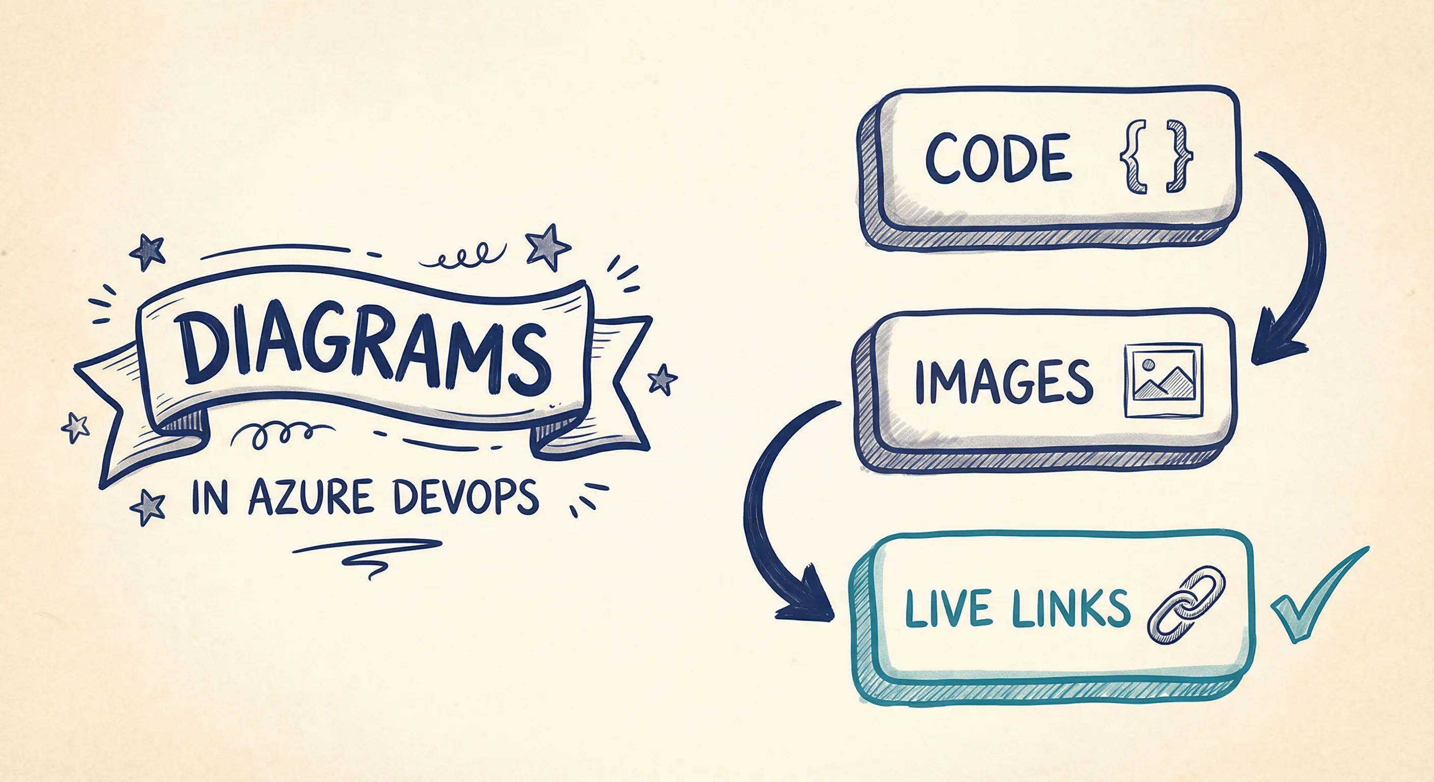
Three ways of handling diagrams in Azure DevOps
Let's have a look at the different option we have for handling diagrams in Azure DevOps.
Option 1 - Diagram as code
Mermaid is a small language used to describe diagrams in a Markdown-like syntax. The tool includes a small engine for transforming these text segments into images. Azure DevOps has Mermaid support built into its online editor.
This "diagram as code" approach is a popular option and comes with a few advantages.
- The diagrams' source is close to the code, making it easier to update them as the code changes.
- Developers prefer changing Markdown and text-based diagrams over third-party drawing tools.
However, there are also a few downsides to this approach.
- As the diagrams are part of the code, only developers can change them.
- As text-based diagrams grow, they quickly become complicated and hard to change.
"Diagram as code" is mostly an option for developer-centric documentation, documenting single components and smaller parts of an architecture. However, it quickly falls short of more advanced use cases when describing overviews and covering more extensive parts of an architecture.
At Spotify, we have an incredibly complex network of thousands of interlinked software systems owned by hundreds of teams, so having a simple way to visualize these connections is essential.
While capturing all of our software in one large diagram is technically possible, it would be very hard to understand and navigate.
We need tools to look at our architecture at different abstraction levels in order to make good design decisions and evolve our software in a sustainable way. Quote from Spotify Engineering blog
Option 2 - Diagram as images
When creating diagrams to communicate, teams often default to general drawing tools such as Draw.io, Miro, PowerPoint, and Visio. These are all great tools, but they often lack the features to describe a complex architecture efficiently.
Many of them are also centered around the concept of an image and a file. This often means that to include the diagram in the Azure DevOps wiki page, we must export it first and then upload it to the DevOps platform. This process quickly becomes cumbersome when we need to make changes and update the diagram.
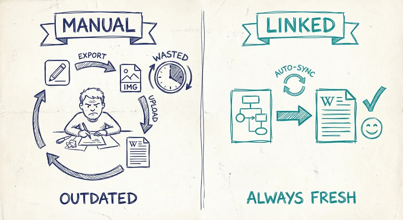
Ultimately, this export/import loop feels repetitive and inefficient, often resulting in incomplete tasks and outdated documentation.
Option 3 - Linked live diagrams
Instead of creating stale images we can use tools that can generate linkable images that are update and generated as the underlying diagram changes. Similar to having generated diagram from code, but without the limitations.
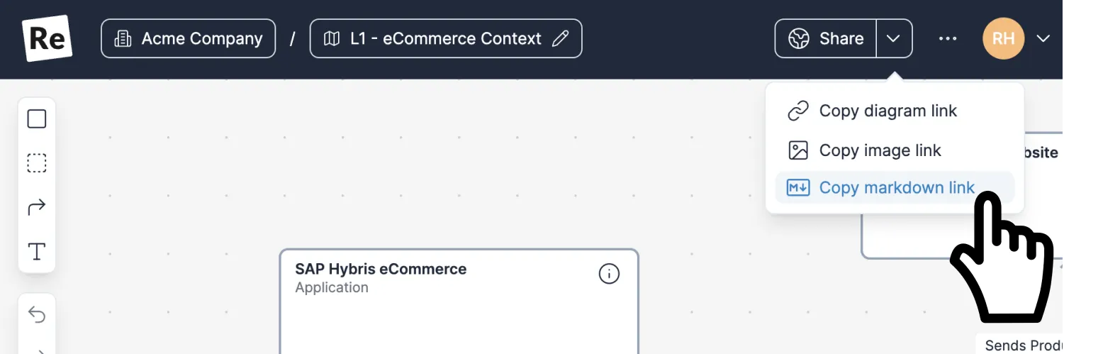
One of Revision's features is the possibility of generating an SVG image on the fly as a diagram updates. This SVG image can then easily be linked from a platform such as the Azure DevOps wiki.
When the diagram changes in Revision, a new image is created and automatically updated in Azure DevOps.
Work with the diagram in a specialized editor
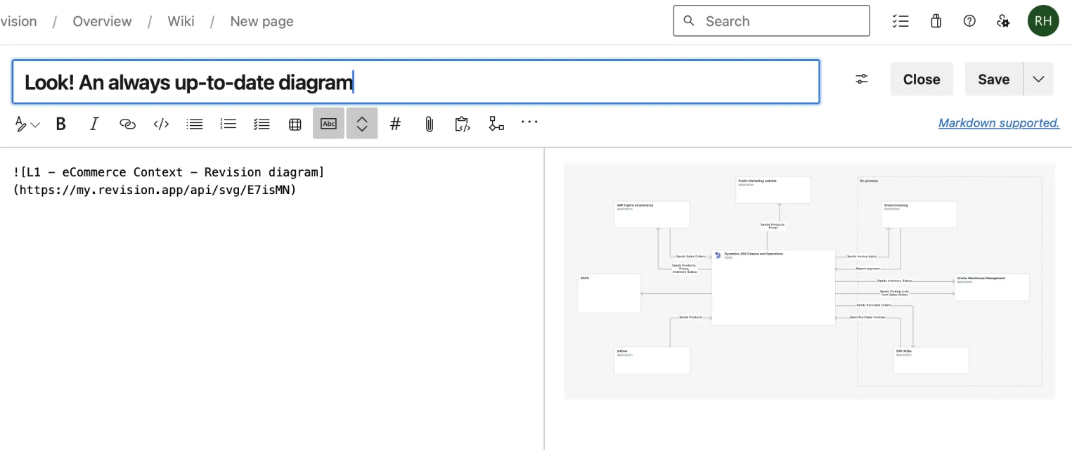
Create and update the diagram in Revision.
Paste link and always have an up-to-date diagram
As the diagram changes Revision automatically updates the image and you'll always have an up-to-date image i Azure DevOps.
This way of working will save a lot of time that can be used for other tasks. It will also improve the likelihood of your documentation and diagrams being up-to-date and reliable.
Summary
If you're only focused on developer-centric documentation that describes a single API, a component, etc., and you're not trying to describe a higher-level overview that also caters to non-technical team members, a diagram-as-code approach probably works just fine.
However, if you are also trying to describe your solutions on a higher level and need more from the diagrams that Mermaid offers, it's probably time to look at more advanced tools rather than solving this with generic drawing tools.
Generic drawing tools are great at creating images, but your team will waste a lot of time and energy trying to keep these diagrams cohesive and up-to-date.
You Might Also Like

Diagram as Code: When Text Wins, When It Doesn't, and What Comes Next
Diagram-as-code promises version control, diffs, and developer workflows. But it also trades visual thinking for syntax overhead. Here's an honest look at when text-based architecture works and when visual-first is better.

Top Icon Resources for Diagrams: Azure, AWS, Google Cloud, and More
Need icons for your cloud architecture or software diagrams? These resources offer the latest Azure, AWS, and Google Cloud icons, and more—saving you time and ensuring your visuals are always up-to-date.

Mermaid vs PlantUML: Which Diagram as Code Tool Should You Choose?
Mermaid is easier to start and easier to embed in docs. PlantUML is broader, deeper, and stronger for C4-heavy teams. Here is how to choose between them, and when neither is the right long-term answer for architecture docs.
Architecture docs, finally.
Turn system knowledge into current architecture docs fast, with linked views and one shared model.
No credit card required