C4 Model Diagrams: Practical Tips for Every Level (With Examples)


When it comes to documenting software architecture, it's easy to get lost in the details - or worse, to create diagrams that no one ever updates or even really understands.
Over the past few years, the C4 model has built a strong and growing following - thanks to its simplicity and its ability to be understood by everyone, not just developers. It's helped teams create diagrams that are actually useful - something that was surprisingly rare before. If you're new to C4, check out our introduction to the C4 model or see how it compares to UML.
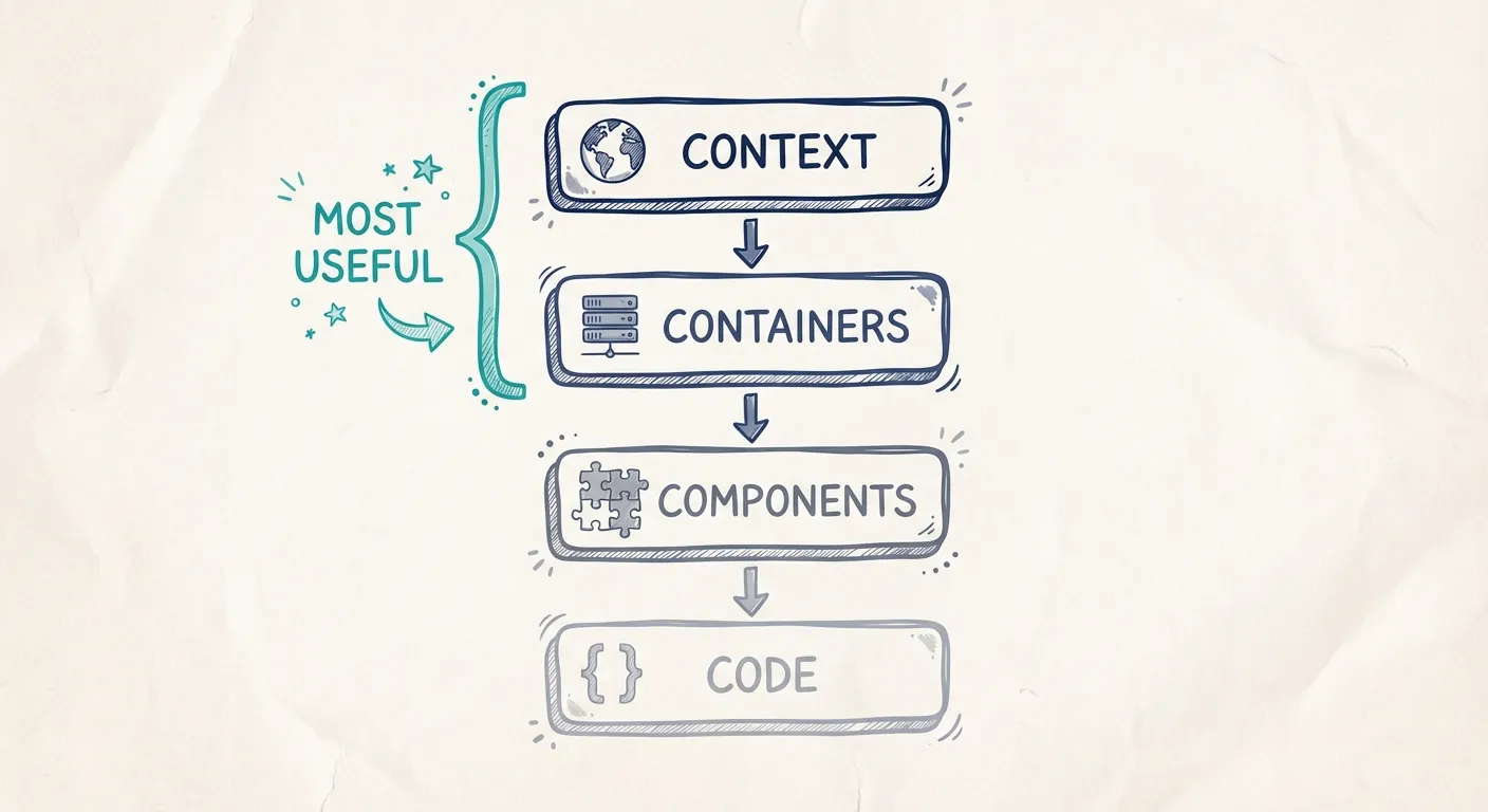
C4 stands for Context, Container, Component, and Code - four diagram types that work together to give a complete view of your architecture. You can start with a high-level overview and progressively zoom in, all while keeping a clear structure and consistent notation.
C4 Model Tips: What You'll Learn
- Level 1 (System Context) and Level 2 (Container) are usually all you need
- If Level 1 feels too abstract, start with a Landscape diagram
- Mixing deployment details into Level 2 may be unofficial - but it works
- Most of the time, modeling users adds clutter, not clarity
Why the C4 Model Is Tricky in Practice
Like most things, it's not always as easy as it seems. On the surface, the C4 model appears straightforward. But a common challenge teams face is knowing what actually belongs in each level. Should a customer portal appear in your Context diagram, or is it part of a Container diagram? What if a system is made up of multiple microservices - does that belong in Container or Component?
These questions can cause confusion, and answering them well is the difference between clear, actionable diagrams and a cluttered, inconsistent set of pictures.
In this guide, we'll break down each C4 diagram level, show practical examples, and explain when to use them. While the overall structure follows the intent of the C4 model, some of our recommendations will deviate slightly from Simon Brown's original guidance and the examples on the official C4 site - reflecting what we've found works best in real-world architecture documentation.
C4 Model Examples by Level
The following sections show practical examples of each C4 diagram level, with guidance on what to include and common pitfalls to avoid.
Level 1: System Context Diagram
The System Context diagram describes one larger system, or one bigger context. It's the "big picture" that frames a capability within the organization.
Think of it as the broad functional area you're mapping:
- E-commerce context: all the systems and applications that together deliver the e-commerce function in your company (website, payment service, order management, fulfillment integration, etc.)
- Finance context: every system that is part of the finance function (ERP, payroll, expense reporting, tax compliance tools, and so on)
On paper, this sounds simple. In reality, it's one of the hardest parts of using the C4 model. Why? Because a context is an abstract concept - not defined by a technical boundary but by how your organization thinks about its architecture.
This means:
- What belongs in "E-commerce" or "Finance" isn't dictated by a tool or a standard
- Your team has to agree on the definition before you can model it effectively
- The goal is to match the diagram to how your organization actually understands and manages that part of the business
Getting the context right is critical - not so much from a purely technical or developer perspective, but from an organizational perspective. The context defines how the business and teams think about the architecture, how responsibilities are divided, and how ownership is structured.
If your contexts don't align with how your organization actually works, your diagrams will be harder to maintain and won't reflect reality. When they do align, they become a shared mental model across technical and non-technical stakeholders - making it easier to discuss changes, assign ownership, and keep the architecture healthy over time.
Once you've done the hard work of figuring out what your contexts are, the rest is relatively straightforward. At this level, you're modeling:
- The main systems within the context
- The data flows or interactions between those systems and external actors (users, other systems, third-party services)
You're not concerned with technical implementation details here - the goal is to show what talks to what, and what kind of information moves between them.
Struggling with context boundaries? A Landscape diagram might help - we'll come back to that below.
Hot Take: Modeling Users and User Interaction
If you look at the official C4 model site or many UML diagrams, you'll notice a lot of users interacting with applications in the diagrams.
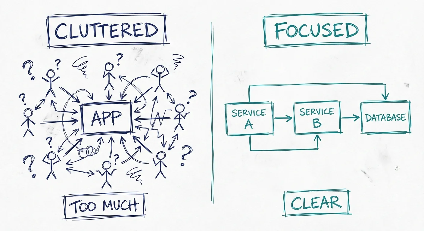
Personally, I rarely find the need to model that explicitly. Maybe it's the nature of the systems I've worked on, but in most cases, it's already obvious where users interact. A web application? Of course there's a user interface. A mobile app? Same thing.
When you already know who the users are and where they connect, adding them into every diagram often just adds clutter without adding clarity. I prefer to keep my diagrams focused on what's less obvious - the systems, services, and their relationships - and leave the human interactions implied unless they're critical to understanding the architecture.
That said, if your audience is non-technical or unfamiliar with the domain, explicitly modeling users might still be valuable. Just remember that every extra icon and arrow comes at the cost of diagram clarity.
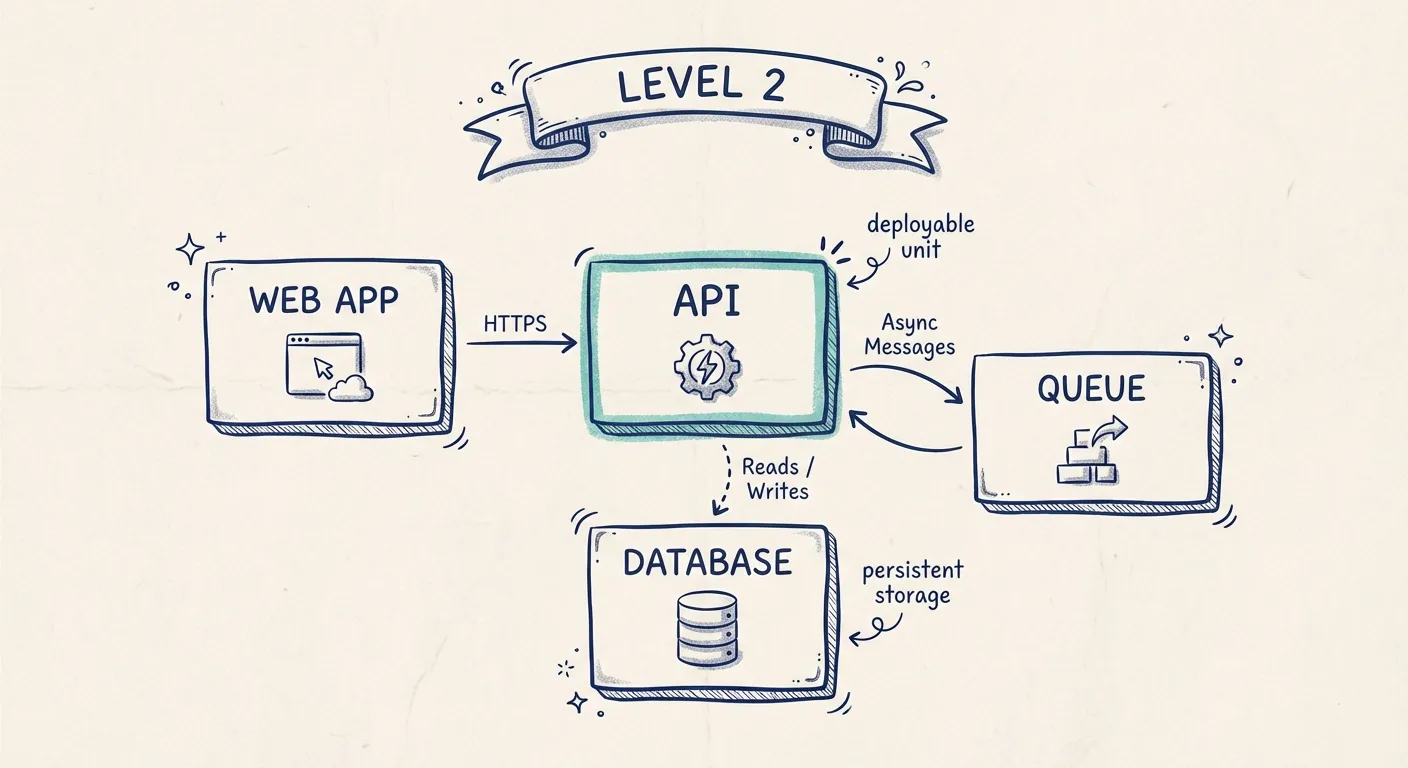
Level 2: Container Diagram
Compared to the abstract nature of Level 1, Container diagrams are usually much easier to create. They're more concrete and technical, dealing with real, tangible parts of the system rather than conceptual boundaries.
At this level, you want to model things like:
- Applications
- Services
- Databases
- APIs
- Other deployable or persistent components
These diagrams often resemble design diagrams that exist even before a project starts, and they're critical for developers and lower-level architects to understand how the system is structured.
The challenge here isn't defining the boundaries - it's capturing the right level of detail. Too little, and the diagram becomes meaningless. Too much, and it becomes cluttered and hard to maintain.
A good approach is to focus on elements that are hard to discover just by looking at the code or infrastructure. That means capturing things like:
- Complex coordination or orchestration steps between services
- Critical business rules that govern interactions
- Data dependencies that aren't obvious in the implementation
If possible, link directly to implementation details - for example, linking a service in your diagram to its README, ADR (Architecture Decision Record), or repository section that explains its internal logic. This keeps the diagram lightweight but still connected to deeper documentation when needed.
Equally important: don't waste time modeling details that can be generated automatically. API endpoints, schema definitions, and protocol specifications are better produced by specialized tools (OpenAPI, AsyncAPI, database schema generators) and then linked from your diagram. This way, your Container diagram stays focused on architectural relationships and decisions rather than duplicating information that will quickly become outdated.
Hot Take: You Don't Always Need All Four Levels
The C4 model has four levels, but in my experience, Level 1 (System Context) and Level 2 (Container) are where most of the value lies.
If you get those two right - clear, agreed-upon contexts and well-structured containers with the right level of detail - you'll already have a shared architectural picture that works for almost every audience, from executives to developers.
Levels 3 and 4: Component and Code
Levels 3 (Component) and 4 (Code) can still be useful, but they're much more situational. They take more effort to maintain, and their audience is smaller. Often, that same information can be found in other places: source code, repo documentation, or specialized diagrams created by the teams who work at that depth.
Instead of going deep into Level 3 and Level 4 in this article, we'll focus next on three supporting diagram types that we've found more useful for most organizations.
Supporting Diagrams
Landscape Diagrams - A Practical Entry Point
A Landscape diagram is, in many ways, a much easier top-level diagram to create than the Level 1 System Context diagram. It's far more concrete. As the C4 model site describes it, a Landscape diagram is essentially a System Context diagram without focusing on a particular software system.
That means you can simply place all the known systems in your architecture on the canvas and connect them with high-level data flows - without worrying about domain boundaries.
In my experience, a Landscape diagram is a great way to get started with architecture modeling. For small to medium-sized architectures, it can even serve as your main diagram, giving a clear, holistic picture of how everything fits together.
Of course, if your architecture grows large or complex, you'll need to split it into contexts to avoid clutter. But for many teams, starting with a single Landscape diagram provides immediate value and a shared reference point - without the upfront abstraction work that a Level 1 context definition requires.
Deployment Diagrams - In Concept vs. In Practice
We all know the guidance: don't mix concrete deployment details into your C4 diagrams. The idea is that deployment should live in its own separate diagram - a dedicated view where all those specifics are described clearly and cleanly. And that sounds great on paper.
But in reality? It means yet another diagram to manage, update, and keep in sync. It's more work.
What usually happens instead is that deployment details start sneaking into Level 2 diagrams. And to be honest - I think that's totally fine. Including deployment context directly in the same diagram often adds more value than splitting it out. Everything is right there, in one place, where people actually look.
Dynamic Diagrams - Or Just Sequence in Context?
The idea behind dynamic diagrams is simple: sometimes it's not enough to show what connects to what - you also need to show what happens, and in what order. Especially in Level 2 diagrams and below, understanding the flow is often critical.
Traditionally, this is the realm of sequence or communication diagrams. In the C4 model, the recommended approach is to create a separate Dynamic Diagram and just number the relationships to indicate order.
And sure, that makes sense - conceptually.
But once again, creating a separate diagram for this adds more overhead. In real-world use, it's often more effective to just add numbered relationships directly in the Level 2 diagram where that flow matters. That way, the sequence is right where the rest of the context lives - and you don't need to jump between diagrams just to understand what's going on.
Sometimes, practicality beats purity.
Summary
The C4 model is one of the most impactful contributions to software architecture in the last decade. It strikes a rare balance: simple enough to use, powerful enough to stay useful. Much of that is thanks to the work of Simon Brown, who created the model and has done an outstanding job promoting a more accessible, structured way to model systems.
This article reflects our own experiences applying C4 in real-world settings. Some of the takes here may deviate slightly from Simon's original guidance - and that's intentional. Take them for what they're worth. Your context, your team, and your architecture may call for different trade-offs.
When in doubt, listen to Simon. But if the model feels hard to apply in some places, we hope these adaptations and perspectives help you get started - and keep going - with diagrams that are actually useful.
C4 Model FAQ
What are the 4 levels of the C4 model?
The C4 model has four levels of abstraction: Context (Level 1) shows how your system fits in the world, Container (Level 2) shows the major technical building blocks, Component (Level 3) shows internal structure, and Code (Level 4) shows implementation details. Most teams only need Levels 1 and 2.
Do I need all 4 C4 diagram levels?
No. In our experience, Level 1 (System Context) and Level 2 (Container) provide most of the value. Levels 3 and 4 require more maintenance effort and their information often exists elsewhere in code and documentation.
What's the difference between C4 and UML?
The C4 model focuses on four levels of abstraction with simple notation anyone can understand. UML provides 14 diagram types with formal notation aimed at software professionals. For most teams, C4 is easier to adopt and maintain. See our detailed C4 vs UML comparison.
What tools support the C4 model?
Several tools support C4 diagrams, including Revision, Structurizr, and general diagramming tools like Miro. Revision is designed specifically for C4 with a diagram-first, model-backed approach.
How do I get started with the C4 model?
Start with a Level 1 Context diagram showing your system's boundaries and external dependencies. Then create Level 2 Container diagrams for the systems that need more detail. Read our introduction to the C4 model for a complete getting-started guide.
You Might Also Like
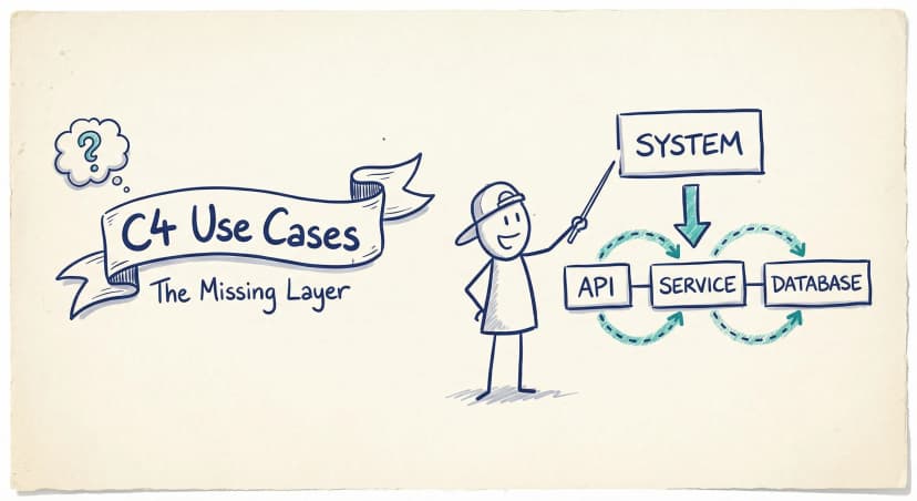
C4 Model Use Cases: The Missing Layer Your Diagrams Need
Your C4 diagrams show what exists. But they don't show how it's used. Here's how to layer use cases on top of your architecture to answer the questions that actually matter.

C4 Model vs UML: Which Should Your Team Actually Use?
UML has 14 diagram types. Most teams use two or three. The C4 model offers a pragmatic alternative: four levels of abstraction that developers actually want to maintain.

Modeling vs Diagramming: Why the Best Teams Do Both
Pure modeling fails because nobody uses it. Pure diagramming fails because it turns into chaos. The teams that get architecture documentation right find the balance — diagram-first, model-backed.
Architecture docs, finally.
Turn system knowledge into current architecture docs fast, with linked views and one shared model.
No credit card required