Rethinking System Architecture Diagrams: Moving Past PowerPoint


You've been there. Someone asks for "the architecture diagram" and you spend 20 minutes hunting through shared drives, Confluence pages, and old presentation decks.
You find three versions. None of them match. One was created by someone who left the company two years ago. Another has a component that was renamed last quarter — or was it deprecated entirely?
Welcome to PowerPoint architecture.
PowerPoint Is Great — Until It Isn't
Let's be fair: PowerPoint has earned its place. It's familiar. It's fast. Anyone can draw a box, connect some arrows, and ship something that looks professional enough for a stakeholder meeting.
For a quick sketch or a one-off presentation, it works fine.
But here's the problem: architecture diagrams aren't one-off artifacts. They're living documentation. They need to evolve with your system. And that's where PowerPoint falls apart.
Three Ways PowerPoint Fails Architecture Teams
1. No way to link diagrams together
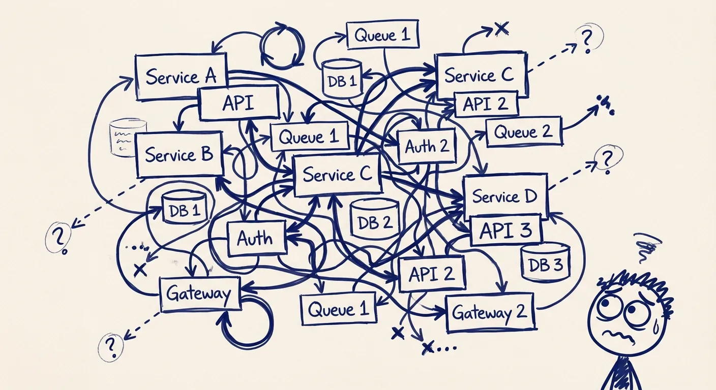
The first instinct when documenting a system is to cram everything into one diagram. Every service, every database, every integration — all on a single slide.
The result? Visual chaos.
The C4 model solves this by splitting architecture into levels: Context, Containers, Components, and Code. Each level serves a different audience. Business stakeholders get the big picture. Developers get the technical details.
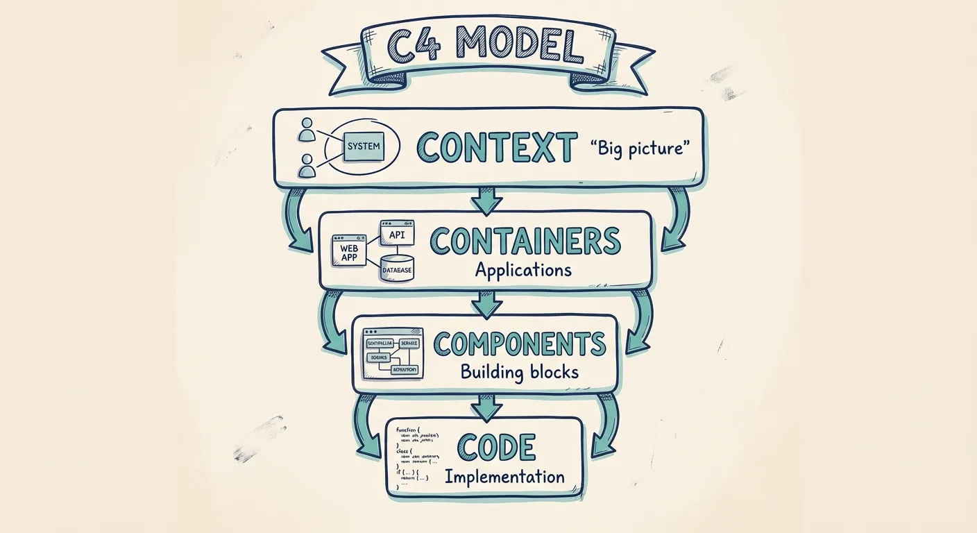
But here's what PowerPoint can't do: link those levels together. In a proper architecture tool, you click on a system in your context diagram and drill down to its containers. In PowerPoint, you're manually hunting through slides — or worse, separate files — hoping the names still match.
When diagrams live in isolation, they drift apart. And drifted diagrams are worse than no diagrams at all.
2. No reusable components, no model
In PowerPoint, every box is just a box. Draw "Payment Service" on three different diagrams, and you've created three independent shapes that know nothing about each other.
Rename the service? Update its description? You're manually hunting through every diagram, hoping you don't miss one.
This isn't just tedious — it's a consistency time bomb.
Real architecture tools work differently. Components have identity. They exist in a model. When you update "Payment Service" once, every diagram that references it updates automatically.
Even better: a model lets you ask questions. "What depends on the Payment Service?" "Which components talk to the main database?" In PowerPoint, answering these questions means squinting at slides and hoping you spot all the arrows.
Teams often end up maintaining shadow spreadsheets alongside their diagrams — a separate list of components, their owners, their dependencies. That's a symptom of using the wrong tool.
3. Impossible to enforce consistency
PowerPoint's flexibility is a double-edged sword. Every diagram author makes their own choices: box colors, line styles, icon sets, fonts.
Six months later, you're looking at architecture documentation where databases are blue circles in one diagram and green cylinders in another. Arrows mean data flow on one slide and "ownership" on the next. Nobody remembers what the dotted lines were supposed to represent.
This isn't just aesthetics. Inconsistent notation forces readers to re-learn how to read each diagram. It slows comprehension. It introduces ambiguity.
Specialized tools solve this with standardized palettes, icon libraries, and shared styles. Everyone draws from the same toolkit. Diagrams look like they belong together — because they do.
What Architecture Teams Actually Need
If PowerPoint isn't the answer, what is? Here's what modern teams should look for:
- Linked diagrams: Click to drill down, navigate up for context
- Reusable components: One source of truth, reflected everywhere
- Model-backed structure: Query your architecture, not just look at it
- Consistent styling: Shared notation that readers can learn once
- Collaboration: Real-time editing, not emailing .pptx files back and forth
You don't need a heavyweight enterprise architecture tool with six-month implementation timelines and mandatory certifications. You need something that keeps the simplicity of drawing while adding just enough structure to make your diagrams actually useful.
A Diagram-First Alternative
Revision was built for exactly this gap.
It feels like a drawing tool — drag boxes, connect arrows, move things around. But behind the scenes, you're building a model. Components have identity. Diagrams link together. Change something once, and it propagates everywhere.
You get the speed of PowerPoint without the maintenance nightmare. You get structure without ceremony.
For teams using the C4 model — or teams who should be — it's the fastest path from "we need to document our architecture" to "everyone actually understands our architecture."
When to Make the Switch
PowerPoint will always have its place. Quick sketches, brainstorming sessions, presentations where the diagram is incidental — these are fine.
But if your architecture diagrams are supposed to be documentation — if they're meant to onboard new developers, guide decisions, or serve as a source of truth — then you've outgrown PowerPoint.
The question isn't whether specialized tools are better. It's how much time you're willing to spend fighting the wrong tool before you switch.
Ready to move past PowerPoint? Try Revision free and see what architecture documentation looks like when your diagrams actually stay in sync.
You Might Also Like

Diagram as Code: When Text Wins, When It Doesn't, and What Comes Next
Diagram-as-code promises version control, diffs, and developer workflows. But it also trades visual thinking for syntax overhead. Here's an honest look at when text-based architecture works and when visual-first is better.

Top Icon Resources for Diagrams: Azure, AWS, Google Cloud, and More
Need icons for your cloud architecture or software diagrams? These resources offer the latest Azure, AWS, and Google Cloud icons, and more—saving you time and ensuring your visuals are always up-to-date.

3 Options for Using Software Diagrams in Azure DevOps: The Pros and Cons
Explore three different approaches to using software diagrams in Azure DevOps. Covers "diagram as code" with Mermaid, importing diagrams, and integrating always up-to-date diagrams from Revision.